• Skip to primary navigation
  • Skip to main content

Halftone.us HomepageHalftone.us

Halftone Illustrator, Photoshop & InDesign Patterns & Fills

  • Halftone Tint Packs
    • Learn More
    • Illustrator Tint Pack
    • Photoshop Tint Pack
    • InDesign Tint Pack
  • Examples
  • How-To
  • Support
    • FAQ
    • Contact
  • Blog
  • 0 items

Blog

Halftone Tint Pack Featured in Uppercase Magazine

May 3, 2018 by admin

The Halftone Tint Pack has a nice blurb in Uppercase Magazine, Issue 37. Uppercase publishes books and magazines for the creative and curious — publications that spark the imagination and inspire creativity.

Halftone Tint Pack featured in Uppercase Magazine

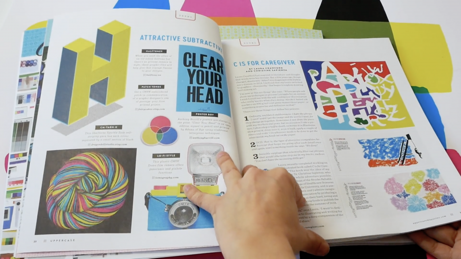
Here’s how Publisher Janine Vangool describes this issue:

“Although every issue of UPPERCASE could be described as a celebration of ink on paper, in this particular edition we’re diving into the substance of what makes a colourful publication like this one possible—that very special combination of tiny cyan, magenta, yellow and black dots that work together to create everything you see printed on this page. (Get a magnifying glass and get in real close! Enjoy that inky smell, too! The vegetable-based inks really smell great on our 100% recycled paper stock.)”

Filed Under: As Seen, Featured

Distress Textures are a Cop-out: #2 Overprinting

July 14, 2016 by admin

In our previous post we talked about why making something look beat up, wasn’t the same as making it look like it’s from another era. Just as a mint ’69 Camaro still looks like it’s from 1969 … there are qualities to printed pieces that are inherent to the “golden age” of printing which are not commonly seen today. One of those qualities is overprinting.

There are two rules you need to understand first:

1. It’s tough to line up different colors exactly when printing.
2. Ink is not opaque.

When one color prints on top of another color, the color that results is a mixture of the two colors (see rule #2). That might be what you want, or maybe not. In the olden days, If you didn’t want that, you’d trim out (“knockout”) the underlying color from your design, so you’d just leave the color you want, without any intermingling of the two. It’s tough to trim things out exactly because there’s some variation in the alignment of different colors plates when printing (see rule #1). This could result in thin unprinted areas where the paper shows through. For this reason, a little bit of overlap is built-in to traditional designs, to allow for some small degree of error. This is called trapping or spreading … but that’s the topic of of our next post … For now, just understand that it can be a pain in the ass to overlap colors precisely.

Now think about what happens when you overlap two colors that are very different from one another … say black and yellow. The black is so much darker, you’ll barely notice the yellow underneath it. You can just say “what the hell,” and print the black right over the yellow without trimming away any of that yellow shape. That’s overprinting … just putting something right over top of something else and not caring too much about whether the thing underneath is knocked out.

In addition to the print-production reasons for overprinting, there are aesthetic reasons as well. It’s a nostalgic effect and a little bit of a throwback to a bygone era when people actually had to think about this sort of thing. The “look” of overprinting can be subtle, like we mentioned with the black/yellow example, or it can be done more concertedly, like magenta overprinting yellow to make a red intersecting area.

In Adobe Illustrator, PhotoShop or InDesign, the easiest way to create an overprinting effect is to set two intersecting shapes’ transparency to “multiply.” (There’s an “overprint” setting also, but it can be tricky to preview.)

Have a look at some examples from one of our Pinterest boards, then give it a try.

Filed Under: Blog, Design, Featured

Distress Textures are a Cop-out: #1 Introduction

March 19, 2016 by admin

For the last few years, we’ve seen a lot of distress textures applied to artwork to give it a “hand-hewn” look. You know it: the look of rubbed-off ink, peeling paint or rusty patina. Check out any crowd-sourced collection of graphic design assets — You’ll find textures and photoshop templates designed to impart this very look. The effect it has on some artwork is transformative. It’s as if you haven’t really “seen” it until you see what it looks like with such an effect — like you’re seeing it in the “real world” for the first time.

The problem is, making something look old is not the same thing as making it look like it’s from another era. it’s one way to do it, but it’s the most simplistic and heavy-handed.

Let’s use vintage muscle cars as an example: Think about badass muscle-cars from the late 1960s. If you saw a perfectly-maintained 1969 Camaro, you’d still know it was a vintage muscle-car. You’d know it was from that era, because it has the characteristics of cars made during that period — not because it’s a rusty bucket of bolts with squirrels living under that upholstery.

© www.ss396.com
You’d know it was old, even if it wasn’t beat to hell. (© www.ss396.com)

If someone asked you how you knew, you might say something about the “lines,” bulging hood, fat tires, etc. It’s tough to put it into words, but if you know what to look for, you can make a list.

(© www.carthrottle.com)
Not a new Subaru? (© www.carthrottle.com)

Graphic design is similar in that way. There are qualities inherent to artwork created by “traditional” methods that have nothing to do with distress.

Some of them are difficult to put your finger on, the same way it’s tough to describe how the curves of a ’69 Camaro are different than the curves of a 2016 anything.

In the coming weeks, we’ll be publishing a series dedicated to these idiosyncrasies — and how you can leverage them to impart your artwork with indescribable charm and character — without making it look like it was buried in a garbage heap.

Filed Under: Blog, Design, Featured

Map Halftones à la 1956

September 16, 2015 by admin

Cameron Booth is a Graphic Designer with a particularly keen area of interest — transit maps. Recently, he set his sights on a digital recreation of one of his all time favorites — a 1956 Paris Métro Map.

On Booth’s site, he talks about why he chose our Illustrator Tint Pack to recreate the vintage 1956 halftones: “Creating good looking vector-based halftone dots in Illustrator is surprisingly difficult, with results that either look too digital and perfect, or create an unholy mess of millions of paths and anchor points. In the end, I made use of the Halftone.us Illustrator Tint Pack, a collection of lovely, organic-looking, seamless halftone pattern swatches…”

Have a look at the fruits of Booth’s labor, below.

1956_ParisMetro_2Color
Paris Métro Map — the whole enchilada
paris-50p_detail-e1442457020553
Paris Métro Map — detail view (Check out those dots!)

Read the full story about Cameron Booth’s painstaking digital recreation of this 1956 Paris Metro Map here.

Filed Under: As Seen, Blog, Featured

Seen at: Plug Digital

June 13, 2014 by admin

Plug Digital is one of New York’s leading suppliers of wide format graphics, window displays, offset & digital printing, specialty finishing and display services. Plug’s clientele is spread among top retailers, museums, graphic designers, event marketers, and entertainment professionals.

This is what you see when you walk into their lobby:

Halftone Illustrator Tint Pack at Plug Digital

Menagerie Co. put the Illustrator Tint Pack to good use here … Notice those black areas aren’t exactly black. That’s lusciously-irregular Tint Pack 90%. Subtle but very effective.

Filed Under: As Seen, Blog

Expanded Offerings on CreativeMarket.com

September 26, 2014 by admin

Here at Halftone.us, we’re keeping things simple … keeping it dedicated to the dot … as in the halftone dots in our Tint Packs.

On the awesome Creative Market website … it’s another story. We’ve expanded our offerings over there to include some additional super-handy elements. Namely our Big ‘Ol Scans, which are particularly well suited as large format poster backgrounds — and templates for those of you, who like us, cut their teeth designing t-shirts and apparel.

Feel free to head on over there, check out our additional wares, and have a look at some of the awesome stuff created by a gazillion other talented designers!

Filed Under: Blog

Photoshop Tint Pack #1 Texture on Creativemarket.com!

May 7, 2014 by admin

We’ve been a fan of the Creative Market website for some time. If you’re unfamiliar with that site, It’s sort of like Etsy, but for graphic artists that create and sell high-quality graphic elements. Beats the pants off the big stock art sites, if you ask us.

We like the site so much, that we opened a shop on it.

We’re proud to report that the Tint Pack for Photoshop is currently the #1 most popular texture they’re selling over there. Very exciting!

If you are familiar with the site, make sure to head on over to our shop, follow us and like our products.

Photoshop Halftone Pattern Texture #1 on CreativeMarket.com
As proud parents, we feel the need to share this photo of our kid.

Filed Under: Blog

© 2023 Halftone.us