Halftone Illustrator, Photoshop & InDesign Tint Packs Help You Create Digital Artwork with the Soul of Ink.
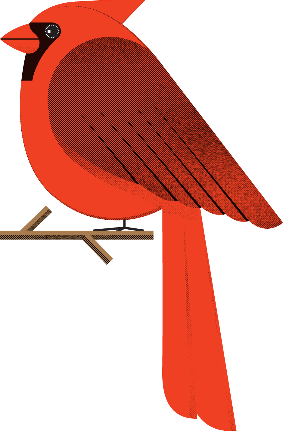
Inspired by the rich, irregular halftone dots from screenprinted posters, comic books & punk rock photocopies
…we created the Tint Pack. With Halftone Illustrator, Photoshop & InDesign Tint Packs, you can achieve ink-like halftone tints while working faster than ever.
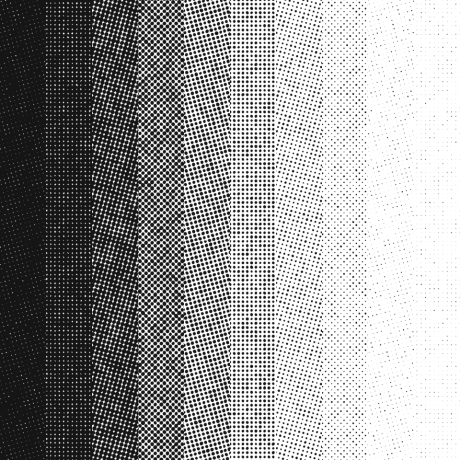
Three Halftone Tint Packs to Choose From
Ai
Halftone Tint Pack for Adobe Illustrator®All vectors!
20 seamlessly-tiled Illustrator repeat swatches
10 densities (5–90%)
28 LPI (lines per inch) at 0-degrees (Rotate and scale them to your heart’s desire, with no loss in quality.)
5.7 MB download
Ps
Halftone Tint Pack for Adobe Photoshop®300 DPI grayscale
40 TIFF files
10 densities (5–90%)
four screen angles
(0, 15, 45 & 75°)
28 LPI (lines per inch)
3600×3600 pixels
88.9 MB download
Id
Halftone Tint Pack for Adobe InDesign®600 DPI bitmap
40 TIFF files
10 densities (5–90%)
four screen angles
(0, 15, 45 & 75°)
28 LPI (lines per inch)
7200×7200 pixels
53.6 MB download
Featured Articles from the Halftone Blog:
Halftone Tint Pack Featured in Uppercase Magazine
The Halftone Tint Pack has a nice blurb in Uppercase Magazine, Issue 37. Uppercase publishes books and magazines for the creative and curious — publications that spark the imagination and inspire creativity. Here's how Publisher Janine Vangool describes this issue: "Although every issue of UPPERCASE could be described as a celebration of ink on paper, in this particular edition we’re diving into the substance of what makes a colourful publication like this one possible—that very special combination of tiny cyan, magenta, yellow and black dots that work together to create everything you see printed on this page. (Get a magnifying glass and get in real close! Enjoy that inky smell, too! The vegetable-based inks really smell great on our … Read More about Halftone Tint Pack Featured in Uppercase Magazine
Distress Textures are a Cop-out: #2 Overprinting
In our previous post we talked about why making something look beat up, wasn't the same as making it look like it's from another era. Just as a mint '69 Camaro still looks like it's from 1969 … there are qualities to printed pieces that are inherent to the "golden age" of printing which are not commonly seen today. One of those qualities is overprinting. There are two rules you need to understand first: 1. It's tough to line up different colors exactly when printing. 2. Ink is not opaque. When one color prints on top of another color, the color that results is a mixture of the two colors (see rule #2). That might be what you want, or maybe not. In the olden days, If you didn't want that, you'd trim out ("knockout") the underlying … Read More about Distress Textures are a Cop-out: #2 Overprinting
Distress Textures are a Cop-out: #1 Introduction
For the last few years, we've seen a lot of distress textures applied to artwork to give it a "hand-hewn" look. You know it: the look of rubbed-off ink, peeling paint or rusty patina. Check out any crowd-sourced collection of graphic design assets — You'll find textures and photoshop templates designed to impart this very look. The effect it has on some artwork is transformative. It's as if you haven't really "seen" it until you see what it looks like with such an effect — like you're seeing it in the "real world" for the first time. The problem is, making something look old is not the same thing as making it look like it's from another era. it's one way to do it, but it's the most simplistic and heavy-handed. Let's use vintage muscle … Read More about Distress Textures are a Cop-out: #1 Introduction


