For the last few years, we’ve seen a lot of distress textures applied to artwork to give it a “hand-hewn” look. You know it: the look of rubbed-off ink, peeling paint or rusty patina. Check out any crowd-sourced collection of graphic design assets — You’ll find textures and photoshop templates designed to impart this very look. The effect it has on some artwork is transformative. It’s as if you haven’t really “seen” it until you see what it looks like with such an effect — like you’re seeing it in the “real world” for the first time.
The problem is, making something look old is not the same thing as making it look like it’s from another era. it’s one way to do it, but it’s the most simplistic and heavy-handed.
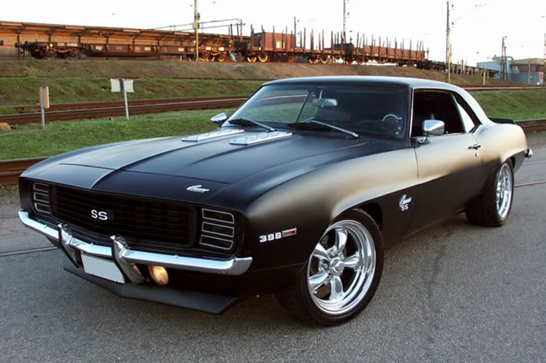
Let’s use vintage muscle cars as an example: Think about badass muscle-cars from the late 1960s. If you saw a perfectly-maintained 1969 Camaro, you’d still know it was a vintage muscle-car. You’d know it was from that era, because it has the characteristics of cars made during that period — not because it’s a rusty bucket of bolts with squirrels living under that upholstery.
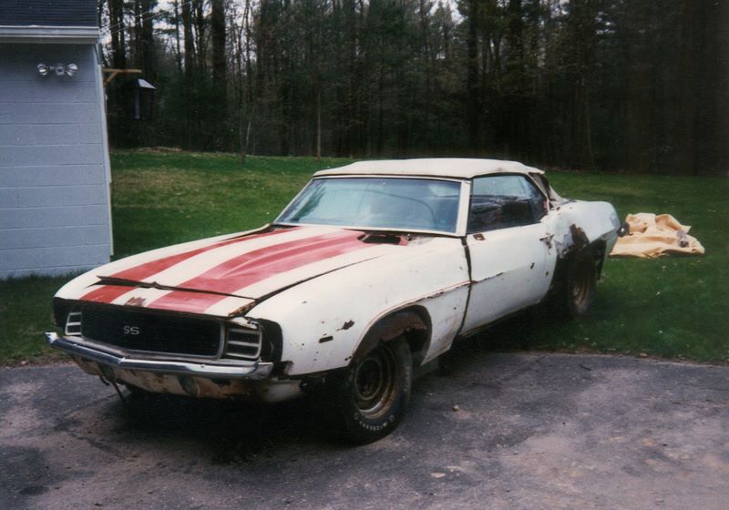
If someone asked you how you knew, you might say something about the “lines,” bulging hood, fat tires, etc. It’s tough to put it into words, but if you know what to look for, you can make a list.
Graphic design is similar in that way. There are qualities inherent to artwork created by “traditional” methods that have nothing to do with distress.
Some of them are difficult to put your finger on, the same way it’s tough to describe how the curves of a ’69 Camaro are different than the curves of a modern anything.
In the coming weeks, we’ll be publishing a series dedicated to these idiosyncrasies — and how you can leverage them to impart your artwork with indescribable charm and character — without making it look like it was buried in a garbage heap.


