First, What it’s NOT:
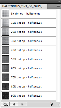
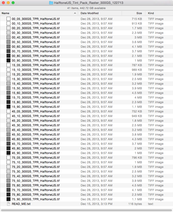
It’s NOT a bunch of random grungy halftones — The Tint Pack contains a full-range of tint patterns, from light to dark, in smooth 10% increments (plus a 5% tint). No more wasted time searching through mismatched, disorganized halftone textures, hoping to find the right shade.
What it IS:
The Halftone Tint Packs are organized libraries of ink-like halftone textures which will allow you to work faster and better than ever before. Until now, your Photoshop, InDesign and Illustrator halftone tints have been technically perfect — but totally lackluster! The Halftone Illustrator, Photoshop and InDesign Tint Packs will work to great effect to make your artwork look as if it were created by human hands. We’re not talking about hands on a keyboard and mouse. More like … hands on a squeegee pushing ink through a silkscreen. Yeah, we know it’s still artwork created on a computer (and likely printed with an inkjet printer), but if you can get an authentic hand-printed look without fumes, cleanup, ruined clothes and sharp objects … why not give it a try?


Why We Developed It:
Most artwork created with modern design software is just too perfect. Graphic Artists who’s work is in demand are hand-drawing lettering, needlepointing illustrations, and using real Scotch tape. Lots of drawing and scanning these days … But there’s one element common to modern artwork (late 1800s–present) you can’t render by hand. Halftone dots. Let’s just say, hypothetically, that you want to add some old-school halftone shading to the side of a super-badass flaming skull … or a birdie’s wing (see our examples). You’re clean out of Zip-A-Tone, Chart-Pak and Letratone because you don’t have a time machine. If you render a Photoshop or Illustrator halftone tint, you’ll end up with perfectly round, uniform dots. Baw-ring. Think about what happens when dots are printed on real newspaper. What happens when ink flows through a silkscreen? (Clue: Not perfectly round, uniform dots.) Though it may seem like a small detail, variability in the size and shape of your dots goes a very long way in making your artwork look more organic. That’s what The Tint Pack does. It gives you “that look,” and there’s no plugin or filter that can replace it.
For Design Geeks:
Obviously you would never draw a 28 line-per-inch halftone. You could, but it would be wildly inefficient. 28 dots x 28 dots means 784 dots for every square inch. And just how big is a 70% dot? Maybe you tried to scan a tint out of a newspaper. Good luck finding the exact shade you’re looking for. Good luck finding a big enough piece! We ran into the same problems, so we developed a process whereby each of our halftone tints (5–90%) has enough variability to lend that “special something” … and just so you know … It’s not a linear process. It’s not as simple as rendering an illustrator halftone, then randomly varying the dot size by a percentage. You may have to vary your lighter tints by a huge percentage to make the variation obvious, but if you do the same with darker tints it looks downright silly. We strived to make our tints look natural … or just a tad exaggerated. What can we say? We dig dots.
For Super-Duper Design Geeks, Only:
You might be saying to yourself, “That’s not a halftone,” and technically you would be right. If you want to be persnickety, they’re Ben-Day dots because collectively they apply a uniform shade (not like a gradient or the smooth transitions in a black and white photo). The popularization of the Ben-Day dot is generally attributed to Roy Lichtenstein, the grandaddy of pop art. But his approach is practically the opposite of ours. Roy used traditional methods to render uniform dots. By using The Tint Pack, modern methods result in a non-uniform dot. Pretty cool, huh?


